Comparisons through Charts
I've generated some graphs to illustrate some lesser-illustrated facts about gasoline prices and Oil and Gas companies.
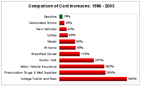 Bureau of Labor Statistics
Yet there is no public outcry against breakfast cereal, no added taxes for successfully selling Cheerios.
Here's another one, showing profit margins across industries (click to enlarge):
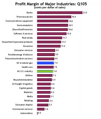 This one is from Western States Petroleum Associaton; data from Businessweek and 10-Ks. Sure, the larger O&G companies earn billions of dollars per quarter, but they also suffer billions of dollars in costs, making their margins slim and in line with the average, as this graph depicts. Tech companies, on the other hand, dominate the upper portion of profit margins, yet are applauded (if not encouraged) to do so by the public. Is there a double standard?
posted by Grant Fox at
9:25 AM
![]()
![]()

0 Comments:
Post a Comment
<< Home